
ENVOY BRAND & WEBSITE EVOLUTION
Enterprise confidence.
Distinctly Envoy.
Evolving a distinctive workplace brand for enterprise buyers—connecting creative direction, reusable systems, and testing.
MY ROLE
Lead creative
Design strategy & direction
COLLABORATION
Content, web & brand design
An entirely internal team
SCOPE
Brand evolution
Website & conversion journeys
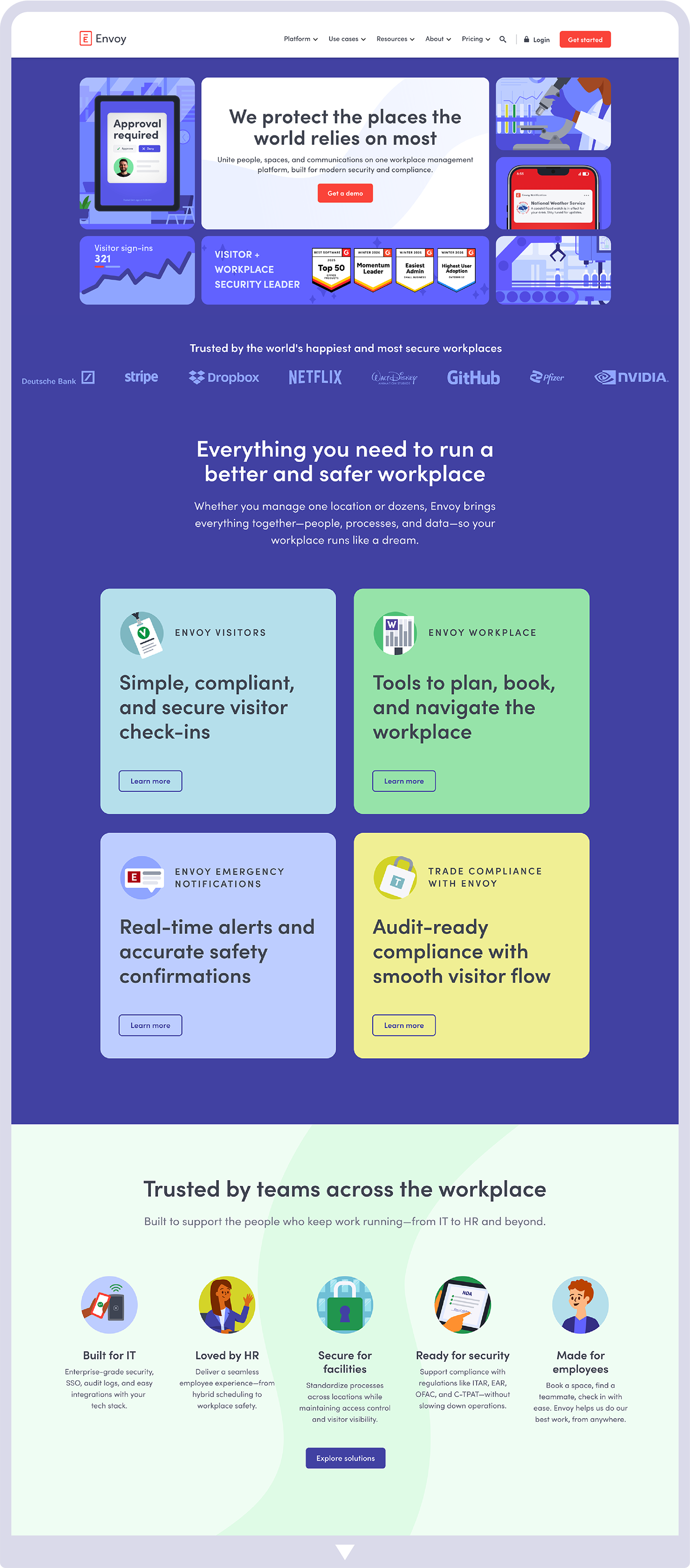
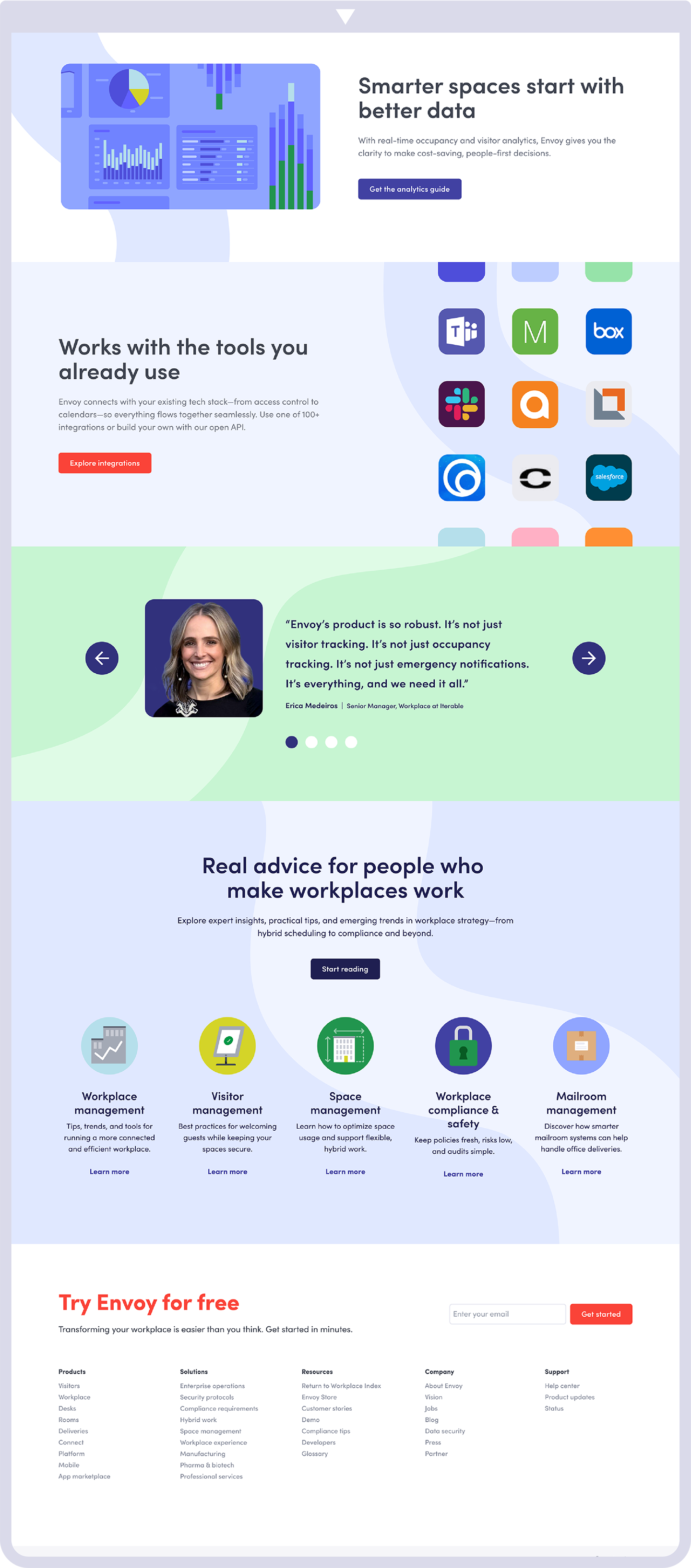
The full redesigned homepage, shown in two consecutive sections: start on the left and continue on the right.
The business challenge
Move upmarket. Keep the character.
Envoy was targeting larger organizations and moving from individual workplace products toward a broader platform. The story was shifting from making work fun toward making work secure. The brand needed to communicate enterprise maturity while retaining its recognizable personality.
Lead the evolution.
I owned the design concepts and creative strategy, working with content on messaging and with our web manager on Webflow components and website test designs. I also mentored a brand designer who supported design exploration and image production.
To build alignment around the shift, I used examples from established enterprise brands as concrete reference points. We developed the new direction alongside ongoing marketing work, with executive approval throughout.
Make deliberate choices.
01
Shift the color emphasis
Keep the existing palette and give blue a stronger role.
02
Make the product tangible
Give product UI and the platform story a stronger presence.
03
Define the imagery roles
Retain illustration, add real-world photography, and use each where it supports the message.
Homepage evolution
A clearer story for a different buyer.
The visual shift pairs a more direct security narrative with the distinctive illustration language already associated with Envoy.
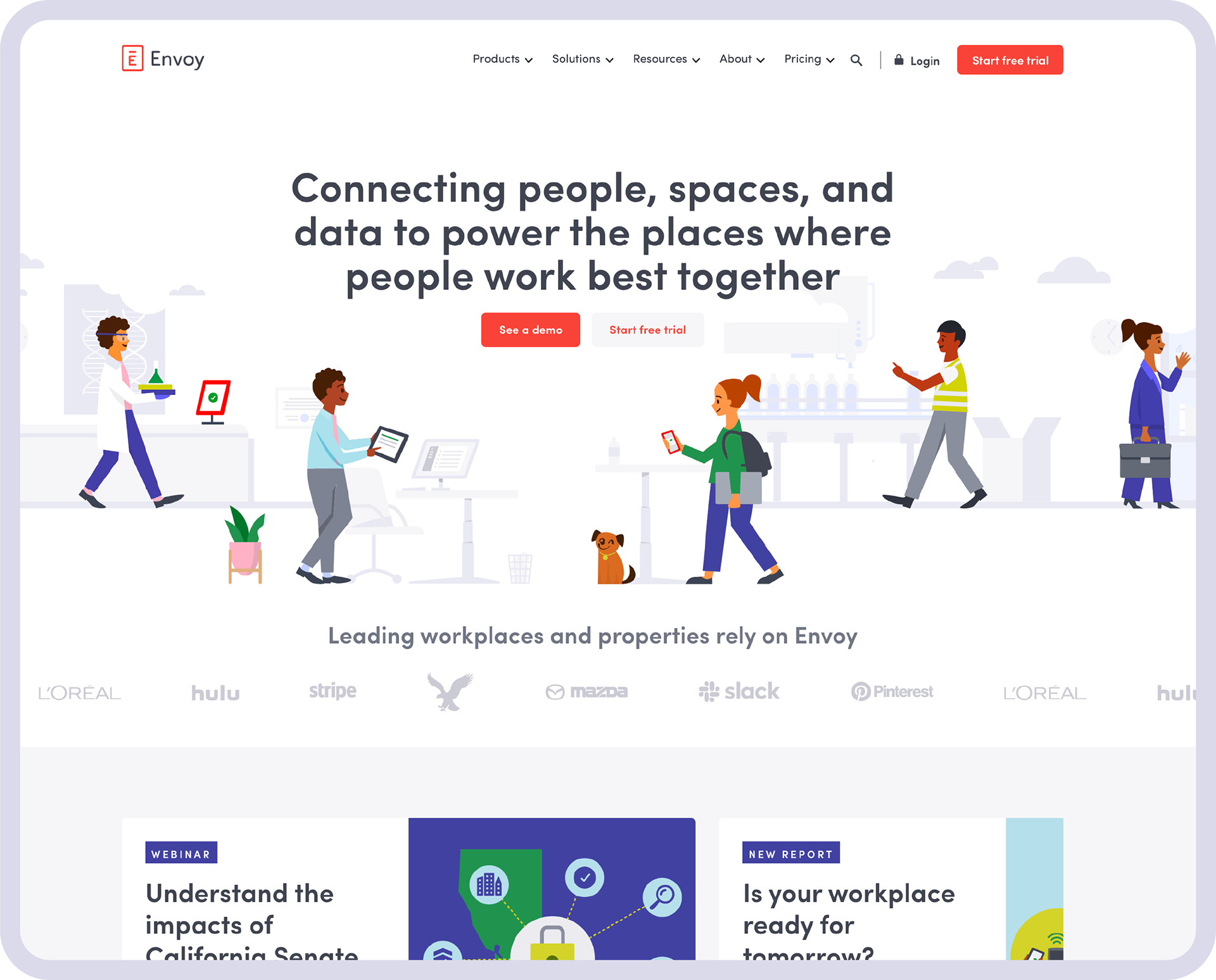
Before · A workplace-focused message with open, playful illustration.
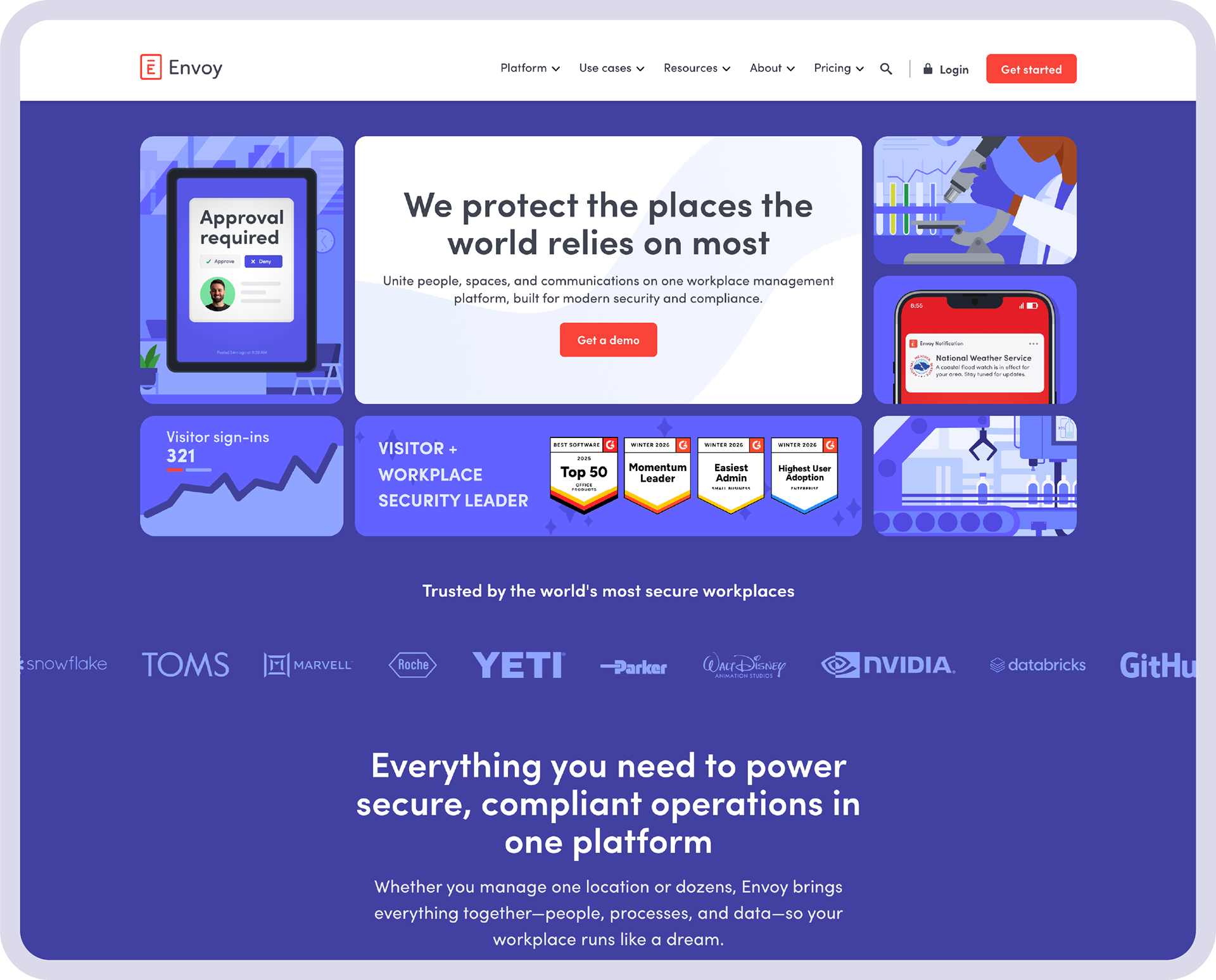
After · A stronger security narrative within a more unified visual system.
Testing to inform the direction
Creative judgment, informed by evidence.
Before the redesign launched, we used A/B testing across paid ads and the existing website to explore different imagery approaches. I worked closely with the web manager on website test designs and used the findings to help guide choices around photography, illustration, product UI, and brand artwork.
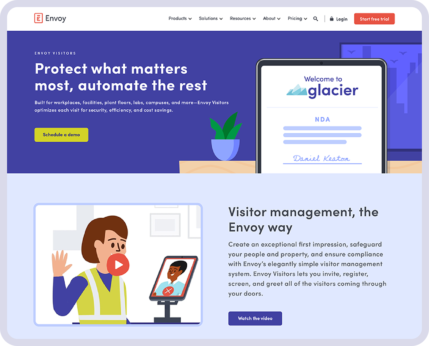
Variant A · Product UI led the hero.
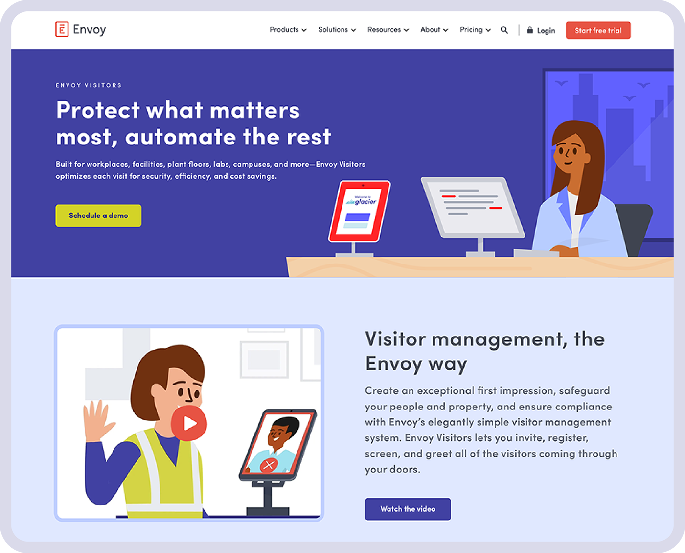
Variant B · Brand illustration led the hero and was the winning direction in this test.
Testing informed the creative direction. These examples precede the major redesign; the post-launch results below are separate before-and-after comparisons.
A system that works everywhere
One direction. Room for different stories.
We established reusable Webflow components to support consistent execution. Illustration, product UI, and real-world imagery could work together across platform, product, and industry pages.
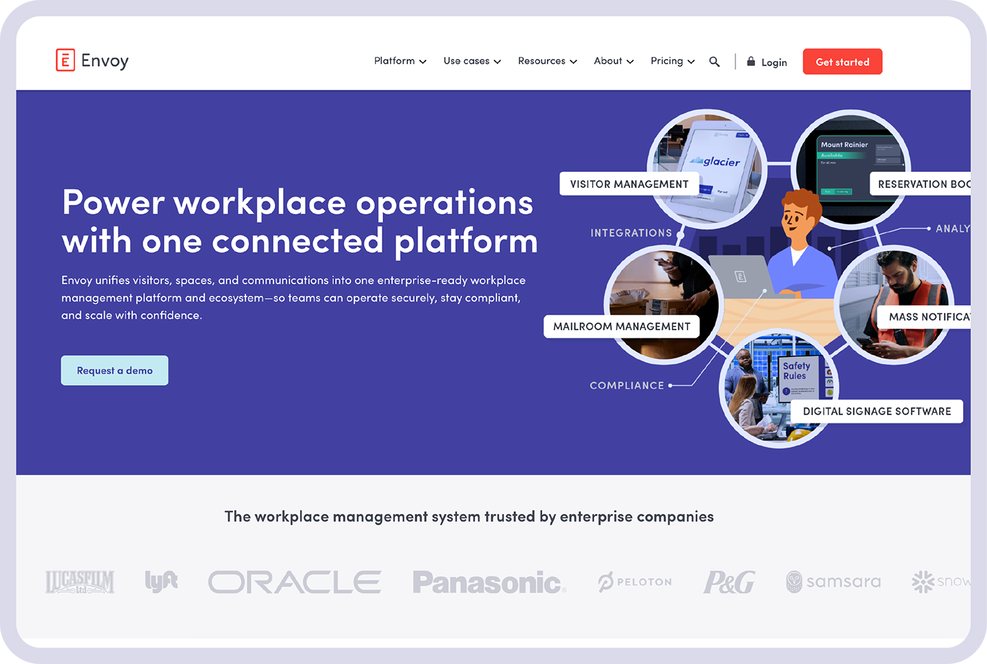
Platform · A diagram brings photography, illustration, and product relationships together.
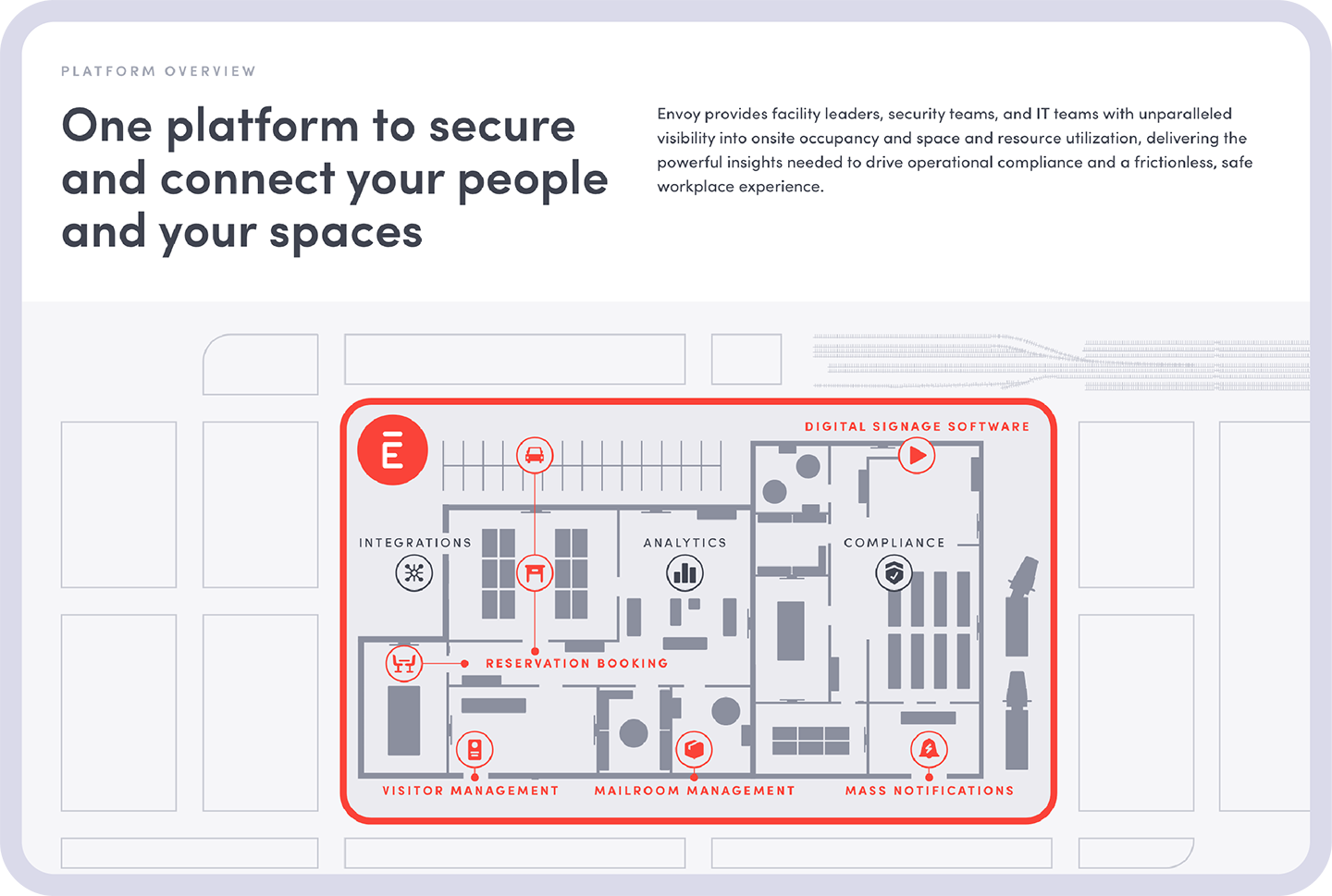
Platform · A broader view of the connected product offering.
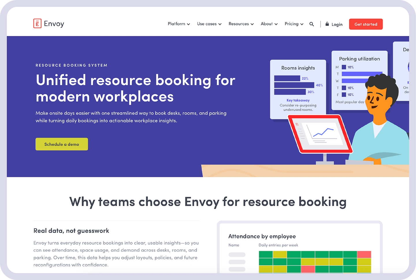
Product · Illustration supports resource-booking storytelling.
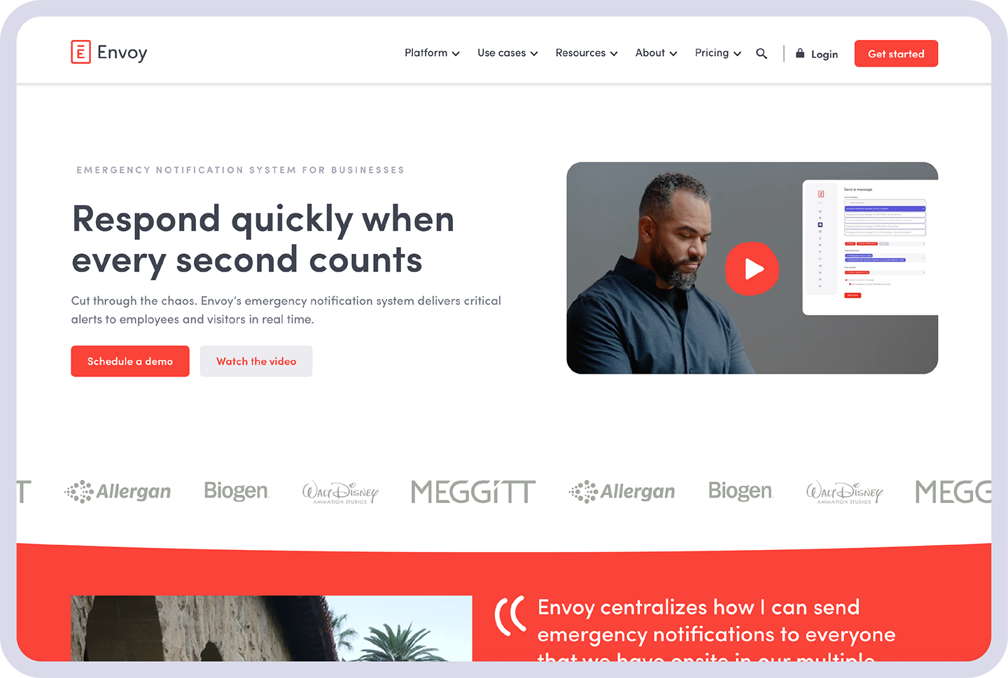
Product · Real-world photography supports emergency-response messaging.
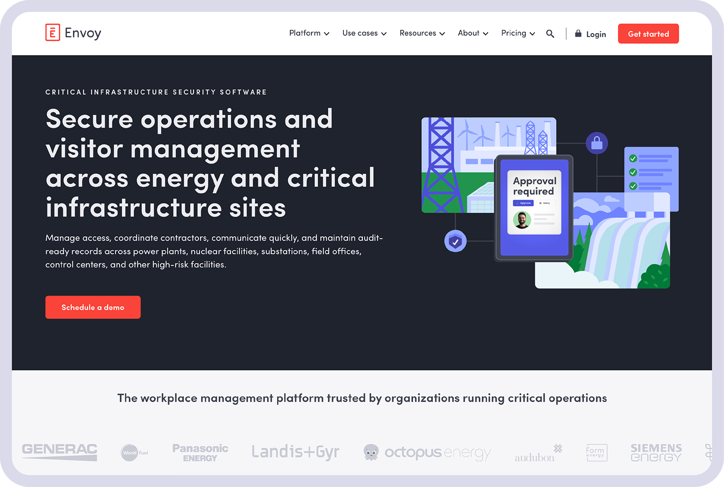
Industry · Updated illustration supports a security-focused message.
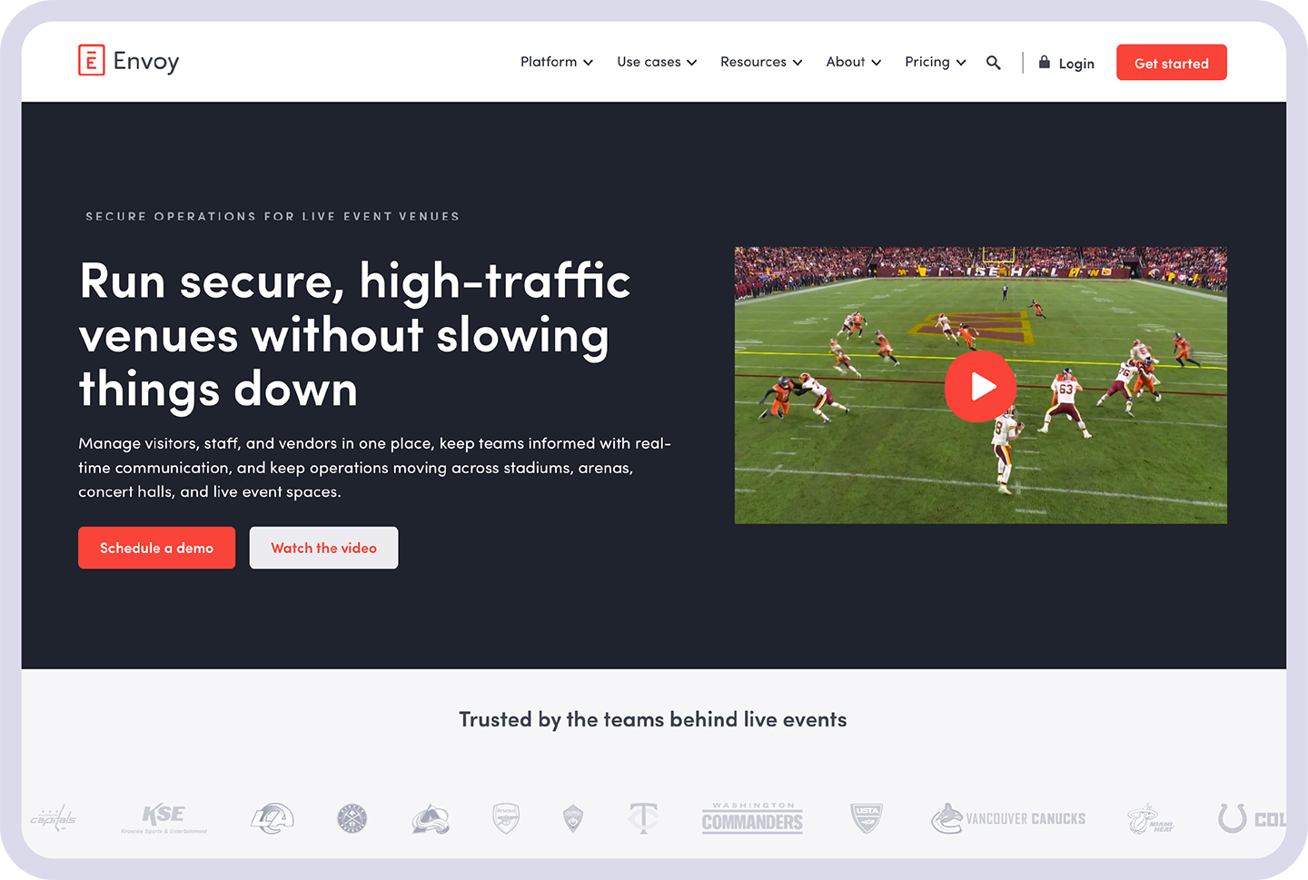
Industry · A real-world video still connects the story to live-event environments.
Observations
Stronger conversion across two key journeys.
For each page, these results compare one month of web traffic before publication with one month after publication.
HOMEPAGE REDESIGN
+15%
Lead conversion rate
Relative increase
+244%
Demo requests
DEMO PAGE REDESIGN
0.56% → 2.87%
Conversion rate
+233%
Demo leads
Measurement context · These are observational pre/post results, not A/B test results. Cookie-consent changes affected measured traffic during the comparison period; the figures do not isolate the effect of design alone.
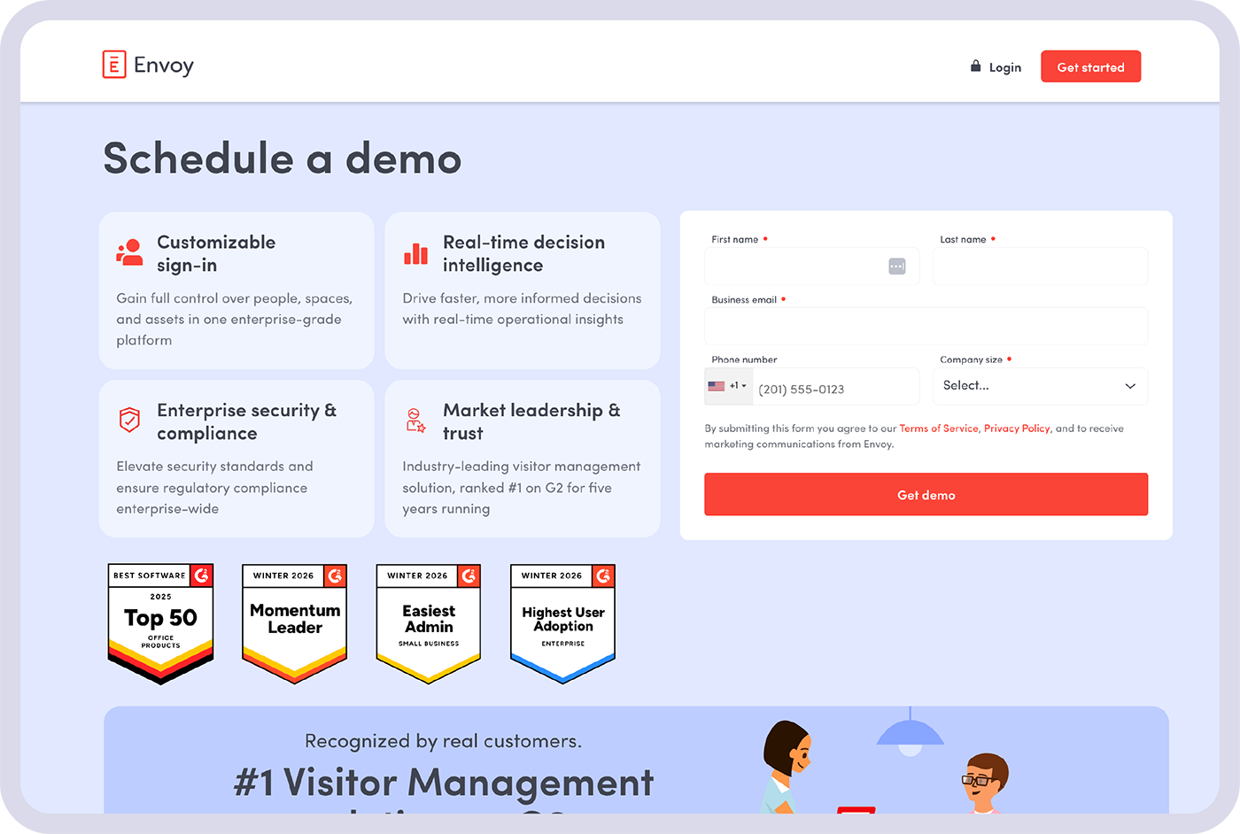
The redesigned /demo page supports a shift toward demo requests with clear benefits, trust signals, and a focused form.
What this work reflects
A player-coach inside the marketing team.
This project reflects how I work: connect brand strategy with business priorities, build stakeholder alignment, and stay close to execution. The team gained a more cohesive enterprise presence and reusable building blocks while retaining the character that made Envoy recognizable.
I can set the direction, support other designers, and do the hands-on work—while staying willing to evolve the creative based on what we learn.